Neighbour Magazine
Neighbour Magazine
Asbury Methodist Social Service is a Hong Kong non-profit founded in 1978, dedicated to supporting vulnerable groups like the elderly, families, youth, and those facing social challenges through neighbourhood centres and community services for inclusion and empowerment.
Client
Asbury Methodist Social
Asbury Methodist Social
Year
2023
Category
Publication

Background
Background
Neighbour Magazine was established to explore Hong Kong's subdivided flat (劏房) issues, fostering connections and bridging divides while communicating the organisation’s mission of social inclusion, well-being, and advocating for better housing policies.
Neighbour Magazine was established to explore Hong Kong's subdivided flat (劏房) issues, fostering connections and bridging divides while communicating the organisation’s mission of social inclusion, well-being, and advocating for better housing policies.
Background
Neighbour Magazine was established to explore Hong Kong's subdivided flat (劏房) issues, fostering connections and bridging divides while communicating the organisation’s mission of social inclusion, well-being, and advocating for better housing policies.
Solution
Solution
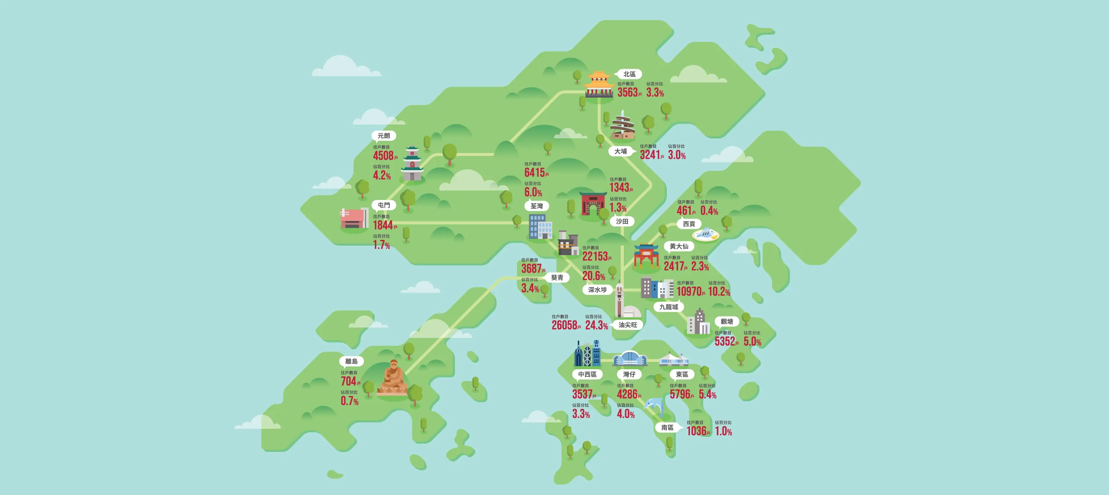
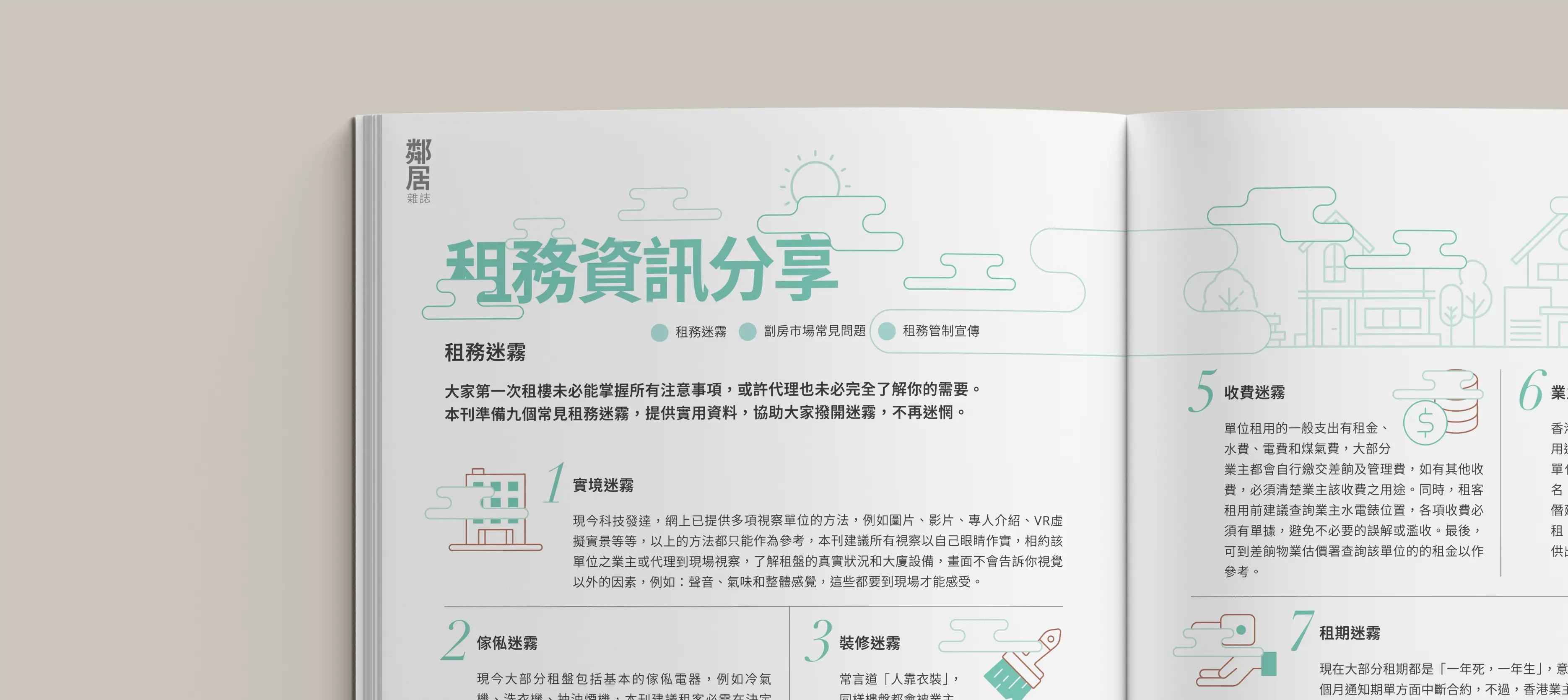
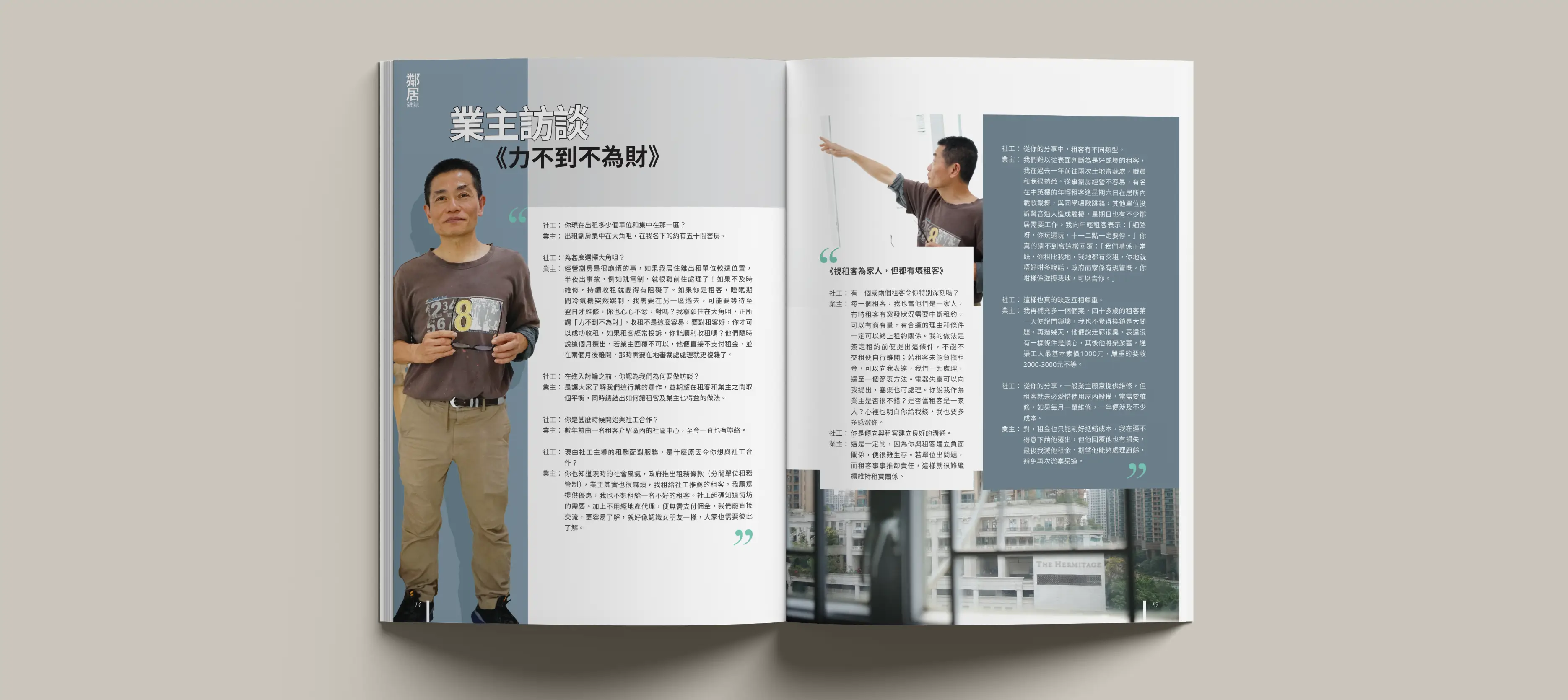
The logo uses striking emerald green to draw attention, with strokes mimicking housing floor plans to symbolise community dwelling. A clean layout features striking photography, clear sans-serif typography, and intuitive structures. Green-toned maps fully present subdivided flat statistics across Hong Kong districts, blending natural hills with urban landmarks for harmony, with central 3D room rendering evoking shared spaces.
The logo uses striking emerald green to draw attention, with strokes mimicking housing floor plans to symbolise community dwelling. A clean layout features striking photography, clear sans-serif typography, and intuitive structures. Green-toned maps fully present subdivided flat statistics across Hong Kong districts, blending natural hills with urban landmarks for harmony, with central 3D room rendering evoking shared spaces.
Solution
The logo uses striking emerald green to draw attention, with strokes mimicking housing floor plans to symbolise community dwelling. A clean layout features striking photography, clear sans-serif typography, and intuitive structures. Green-toned maps fully present subdivided flat statistics across Hong Kong districts, blending natural hills with urban landmarks for harmony, with central 3D room rendering evoking shared spaces.

More Works More Works
More Works More Works

Design Studio Hong Kong
Go Back To Top
Design Studio Hong Kong
Go Back To Top
Design Studio Hong Kong
Go Back To Top
Design Studio Hong Kong
Go Back To Top