BG Jewellery
BG Jewellery
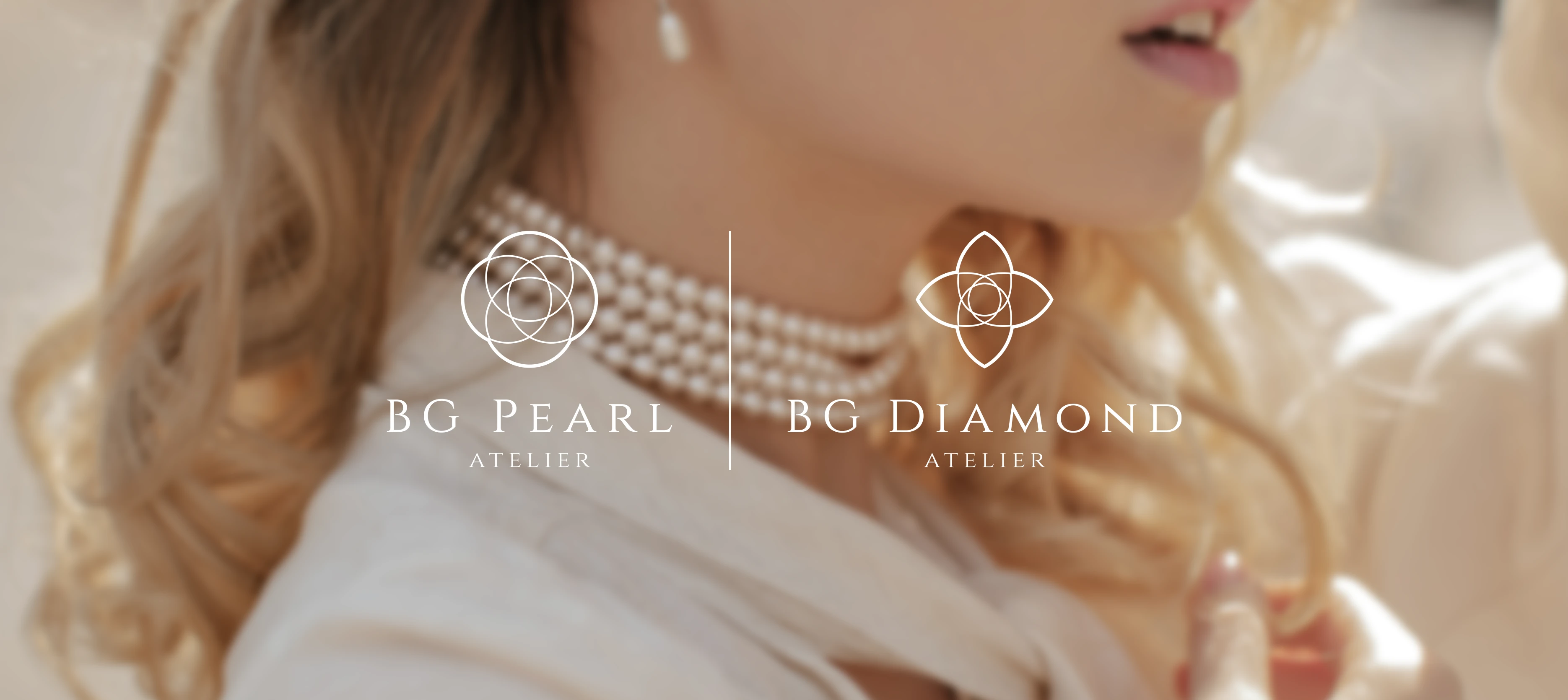
BG Jewellery is a premium jewellery brand established in 1986, specialising in elegant, handcrafted pearl and diamond pieces through its two sub-brands: BG Pearl Atelier and BG Diamond Atelier, targeting modern women who appreciate refined sophistication.
Client
BG Jewellery
BG Jewellery
Year
2021
Category
Visual Identity
Background
Background
The client’s primary need was a distinctive, luxurious brand logo that captures the essence of both BG Pearl Atelier and BG Diamond Atelier, serving as the foundation for all visual communications including printed brochures.
The client’s primary need was a distinctive, luxurious brand logo that captures the essence of both BG Pearl Atelier and BG Diamond Atelier, serving as the foundation for all visual communications including printed brochures.
Background
The client’s primary need was a distinctive, luxurious brand logo that captures the essence of both BG Pearl Atelier and BG Diamond Atelier, serving as the foundation for all visual communications including printed brochures.
Solution
Solution
The logo draws inspiration from the fundamental shapes of pearls (round) and diamonds (pear), repeated and mirrored to form a symmetrical logomark that radiates opulence while remaining understated and refined. A subdued palette of deep green and rich gold — rooted in the logo itself — infuses the printed brochures with an atmosphere of timeless luxury. Clean, minimalist layouts keep the focus on craftsmanship, without special finishes.
The logo draws inspiration from the fundamental shapes of pearls (round) and diamonds (pear), repeated and mirrored to form a symmetrical logomark that radiates opulence while remaining understated and refined. A subdued palette of deep green and rich gold — rooted in the logo itself — infuses the printed brochures with an atmosphere of timeless luxury. Clean, minimalist layouts keep the focus on craftsmanship, without special finishes.
Solution
The logo draws inspiration from the fundamental shapes of pearls (round) and diamonds (pear), repeated and mirrored to form a symmetrical logomark that radiates opulence while remaining understated and refined. A subdued palette of deep green and rich gold — rooted in the logo itself — infuses the printed brochures with an atmosphere of timeless luxury. Clean, minimalist layouts keep the focus on craftsmanship, without special finishes.


More Works More Works
More Works More Works


Design Studio Hong Kong
Go Back To Top
Design Studio Hong Kong
Go Back To Top
Design Studio Hong Kong
Go Back To Top
Design Studio Hong Kong
Go Back To Top