Starteam Global Sustainability Report
Starteam Global Sustainability Report
Starteam Global is a leading global PCB manufacturer and solution provider with over 35 years of expertise. With production facilities in China, Thailand, and Italy, it delivers high-quality, sustainable PCBs to industries including automotive, medical, and telecommunications, adhering to strict international safety standards.
Client
Starteam Global
Starteam Global
Year
2024
Category
Publication
Background
Background
As a pioneer in sustainable PCB manufacturing, Starteam Global sought a sophisticated visual identity that not only reflected its modern, professional ethos, but also communicated its long-standing commitment to environmental responsibility and positive societal impact across global markets.
As a pioneer in sustainable PCB manufacturing, Starteam Global sought a sophisticated visual identity that not only reflected its modern, professional ethos, but also communicated its long-standing commitment to environmental responsibility and positive societal impact across global markets.
Background
As a pioneer in sustainable PCB manufacturing, Starteam Global sought a sophisticated visual identity that not only reflected its modern, professional ethos, but also communicated its long-standing commitment to environmental responsibility and positive societal impact across global markets.
Solution
Solution
The visual identity is built around precise PCB circuitry patterns that symbolise technical excellence and reliability, while maintaining an elegant, approachable aesthetic through clean lines and balanced compositions.
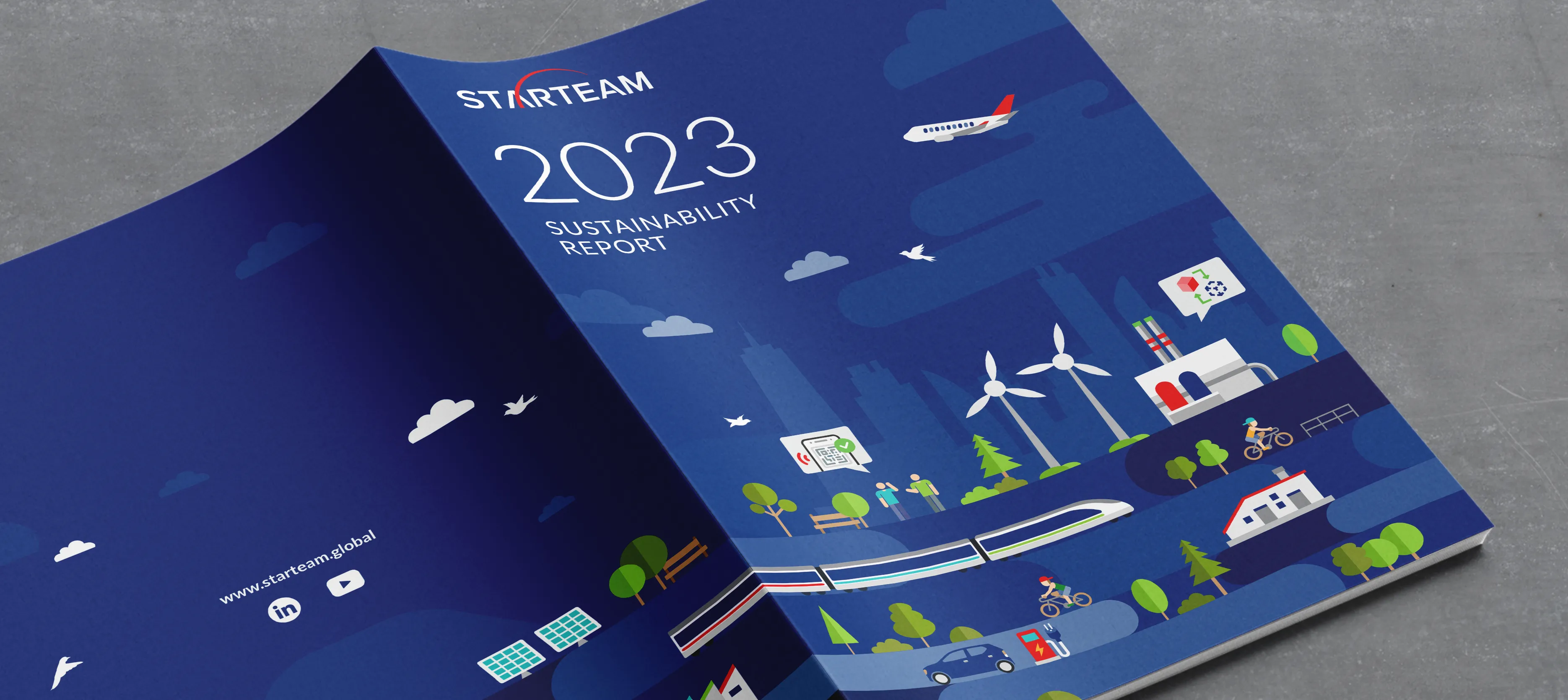
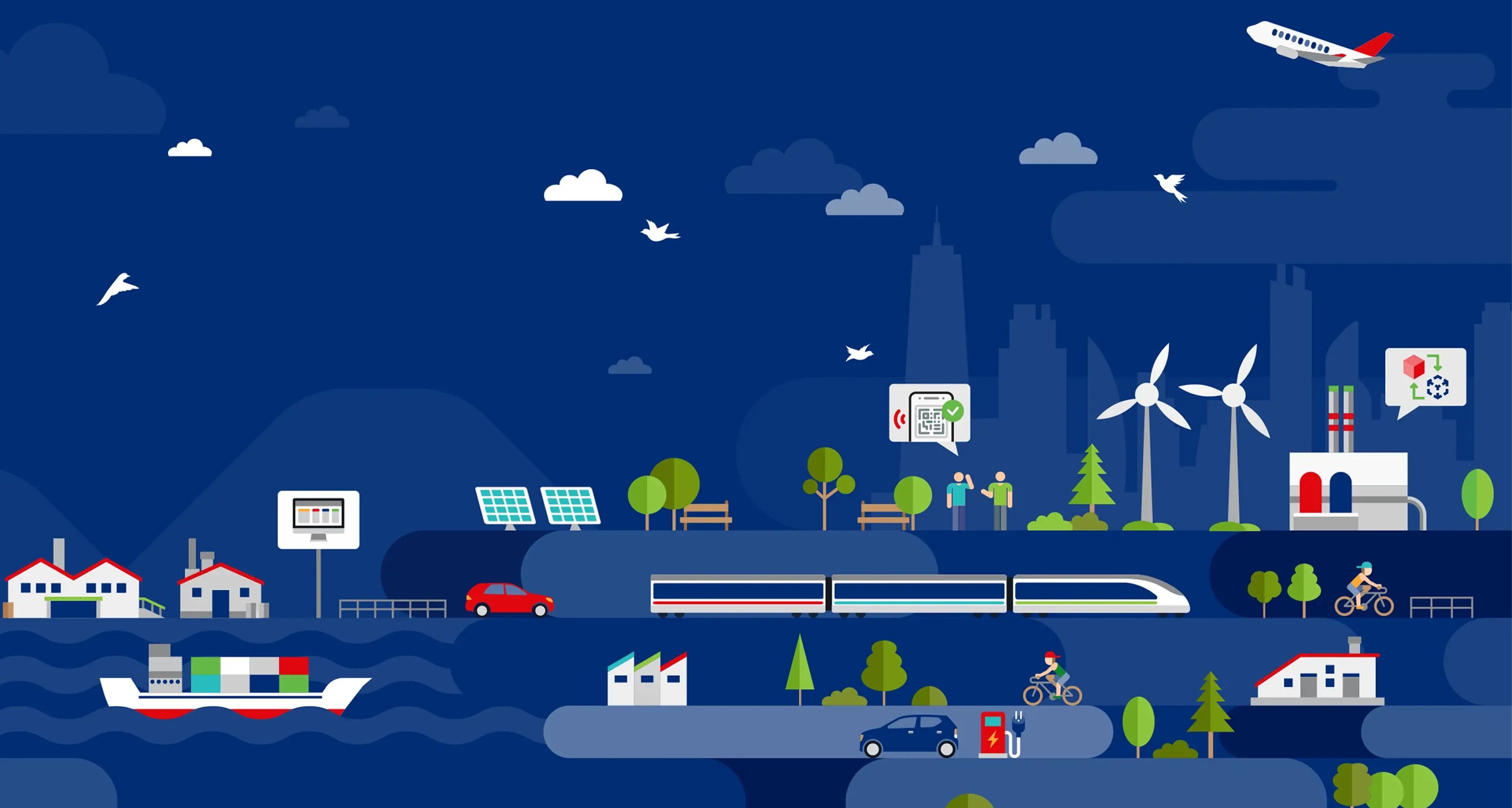
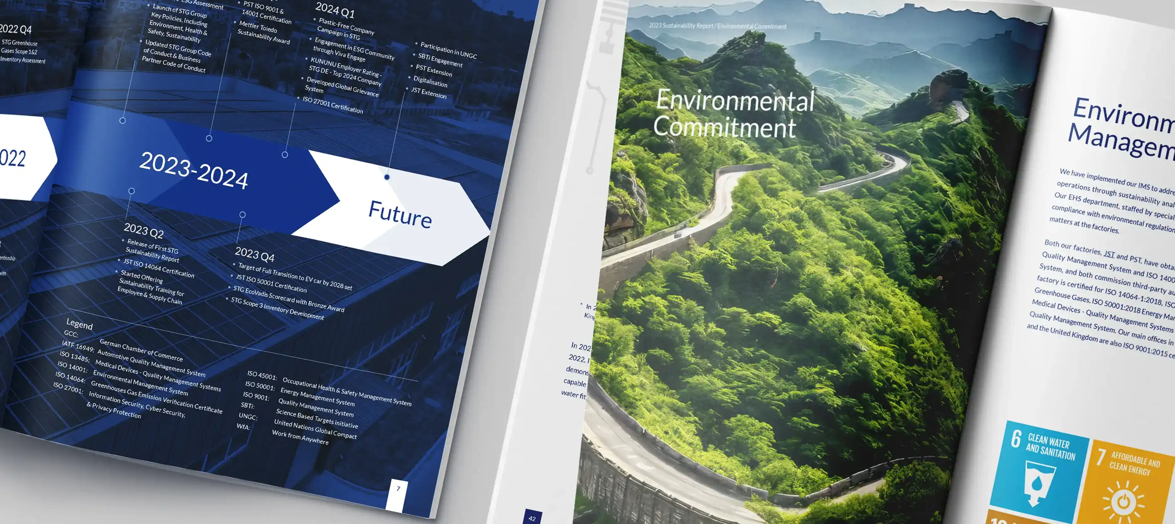
The cover features custom illustrations depicting various objects — such as electric vehicles, renewable energy sources (solar panels, wind turbines), and modern transportation — vividly representing Starteam Global’s contribution to sustainable development across industries.
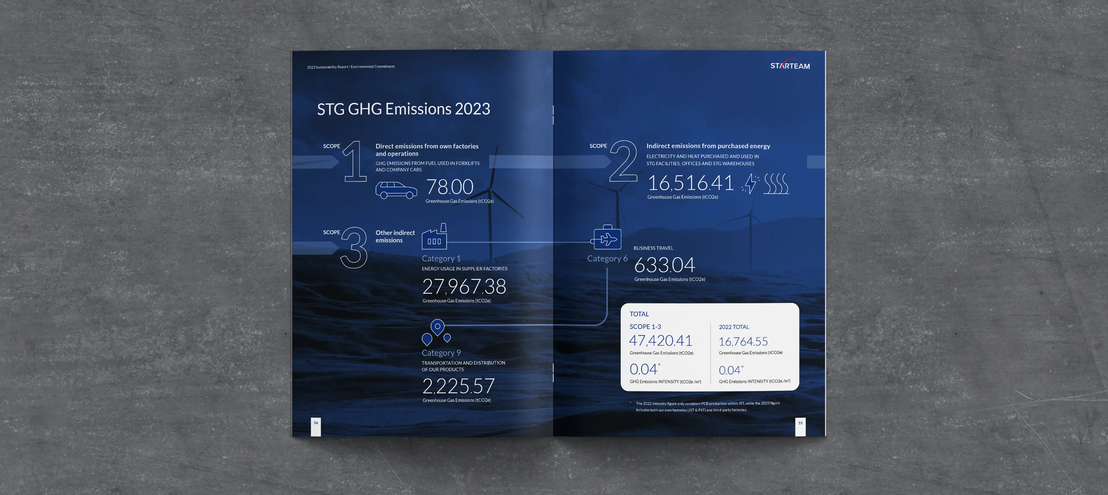
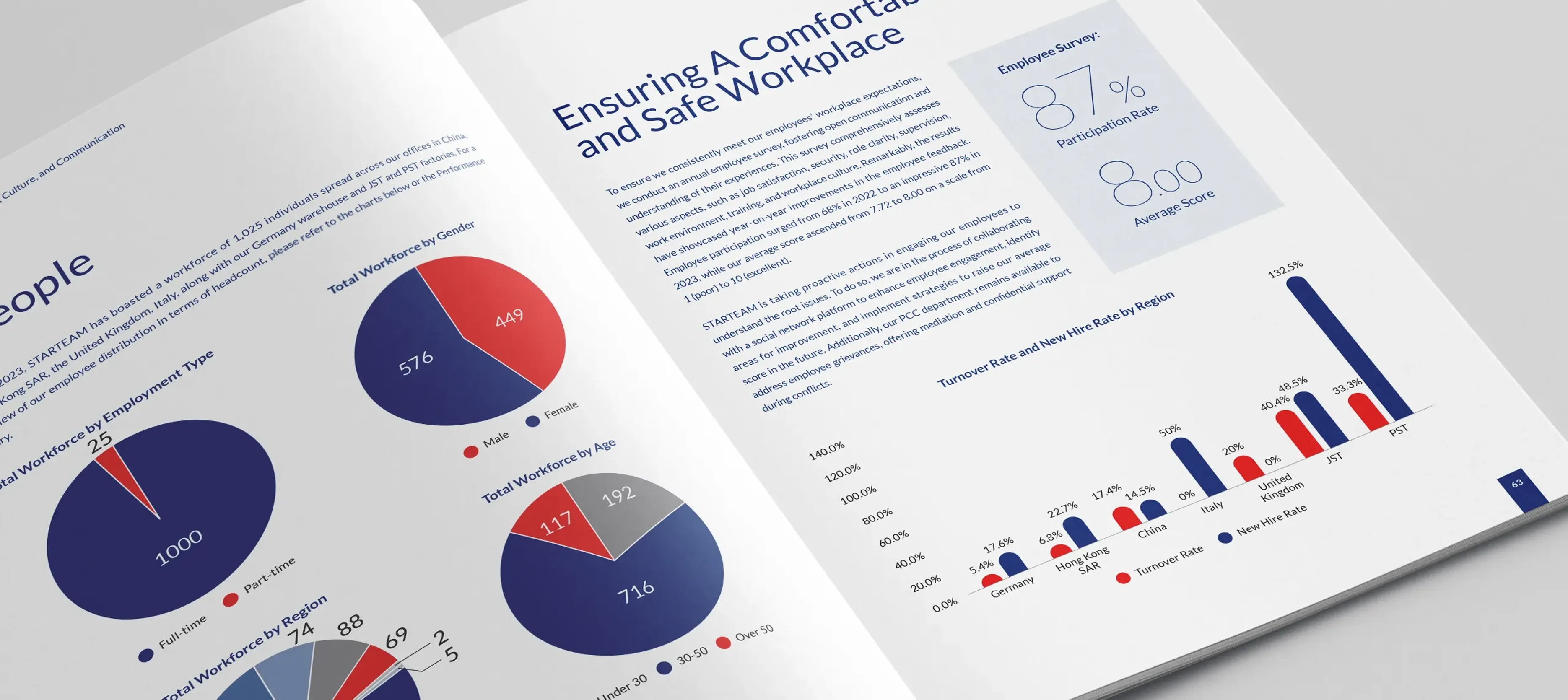
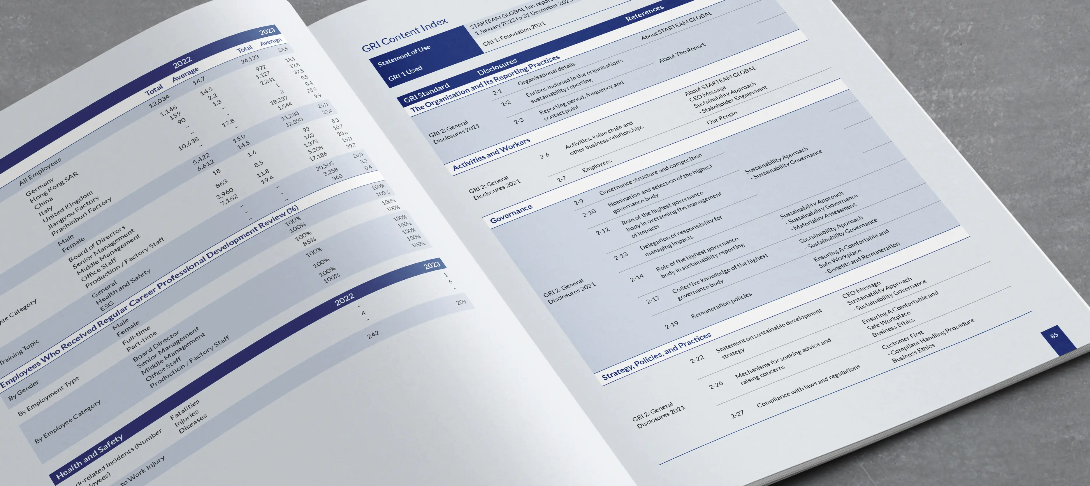
Inside the report, simple and clear infographics present key sustainability data (energy efficiency, waste reduction, and environmental metrics) in an easy-to-understand format, using subtle gradients and organic forms to reinforce transparency and harmony. The overall design employs a contemporary colour palette with trustworthy blues, complemented by refined sans-serif typography, ensuring the identity feels both high-tech and human-centred across all print and digital applications.
The visual identity is built around precise PCB circuitry patterns that symbolise technical excellence and reliability, while maintaining an elegant, approachable aesthetic through clean lines and balanced compositions.
The cover features custom illustrations depicting various objects — such as electric vehicles, renewable energy sources (solar panels, wind turbines), and modern transportation — vividly representing Starteam Global’s contribution to sustainable development across industries.
Inside the report, simple and clear infographics present key sustainability data (energy efficiency, waste reduction, and environmental metrics) in an easy-to-understand format, using subtle gradients and organic forms to reinforce transparency and harmony. The overall design employs a contemporary colour palette with trustworthy blues, complemented by refined sans-serif typography, ensuring the identity feels both high-tech and human-centred across all print and digital applications.
Solution
The visual identity is built around precise PCB circuitry patterns that symbolise technical excellence and reliability, while maintaining an elegant, approachable aesthetic through clean lines and balanced compositions.
The cover features custom illustrations depicting various objects — such as electric vehicles, renewable energy sources (solar panels, wind turbines), and modern transportation — vividly representing Starteam Global’s contribution to sustainable development across industries.
Inside the report, simple and clear infographics present key sustainability data (energy efficiency, waste reduction, and environmental metrics) in an easy-to-understand format, using subtle gradients and organic forms to reinforce transparency and harmony. The overall design employs a contemporary colour palette with trustworthy blues, complemented by refined sans-serif typography, ensuring the identity feels both high-tech and human-centred across all print and digital applications.
More Works More Works
More Works More Works
Calendar Design
Fillture Group
Calendar Design
Fillture Group
Calendar Design
Fillture Group
Calendar Design
Fillture Group

25th Anniv. Commemorative
HKU, School of Chinese Medicine
25th Anniv. Commemorative
HKU, School of Chinese Medicine
25th Anniv. Commemorative
HKU, School of Chinese Medicine
25th Anniv. Commemorative
HKU, School of Chinese Medicine
Design Studio Hong Kong
Go Back To Top
Design Studio Hong Kong
Go Back To Top
Design Studio Hong Kong
Go Back To Top
Design Studio Hong Kong
Go Back To Top